

Case ·
Website launch
We build what connects
DYADIC developed a new brand identity for Fibernow, a turnkey partner for network level 4 in fiber optic expansion, including a slogan, corporate design, and website. The result: a clear, confidence-building presence with technical expertise and human language.
- Client
- Fibernow
- Disciplines
- Content Creation, Storytelling, UX/UI
Starting point
Fibernow is a newly founded company specializing in network layer 4 (NE4) in fiber optic expansion.. An area that many providers have ignored or underestimated until now. The challenge: a completely saturated market with little differentiation in communication and high interchangeability.
CREATIVE APPROACH
The slogan “We build what connects” serves as a common thread throughout the entire presentation—linguistically, visually, and conceptually. It sums up what Fibernow stands for: creating connections—between technology and people, processes and results, aspirations and implementation.
Communication does not use technical jargon, but rather a language that makes complex topics tangible—with clarity, pragmatism, and authenticity.
The website translates this approach into a precise UX/UI system: clear information architecture, functional design, reduced color scheme, and intuitive navigation.
The result was a presentation that positioned Fibernow as a human-technical partner—transparent, competent, and future-oriented.
PROCEDURE
- Competitive analysis of tone, imagery, and USPs
- Development of a messaging house as a strategic basis
- One-on-one interview with the founder about the brand’s DNA
- Creation of personas and target group profiles
- Derivation of claims, headlines, subheads, and page structure
- Text development for UX-optimized website
- Design and technical implementation of the website
Solution
DYADIC developed a completely new brand identity for Fibernow – from strategic positioning, claim, and messaging to corporate design and website.
The goal was to create a presence that reduced the complexity of Network Level 4 to its essentials: clear processes, transparent communication, and reliable results.
The website was designed as a central touchpoint that combines technical expertise with human language. The core of the communication is the claim “We build what connects” – a promise that combines technology and responsibility.
The focus is on clarity, user guidance, and trust: clear messages, modular service presentation, and a tone that conveys professionalism without technical jargon.
Result
The result is a consistent brand image that builds trust and conveys technical expertise.
Today, Fibernow presents itself as a modern turnkey partner for network level 4 – with language that explains rather than confuses, and a design that conveys clarity.
Achieved effect:
- Clear positioning in the market
- Clear communication of services and USPs
- Emotionally engaging language despite technical topics
- Sustainably usable messaging house
- Consistent tone for all future channels
- Consistent brand image with high recognition value
ASSETS
- Brand positioning & messaging house
- Claim, vision, mission, and core messages
- Website texts for all pages (home page, services, about us, contact)
- Headline system, CTAs, and reference structure
- UX-optimized web design with a clear structure and user guidance
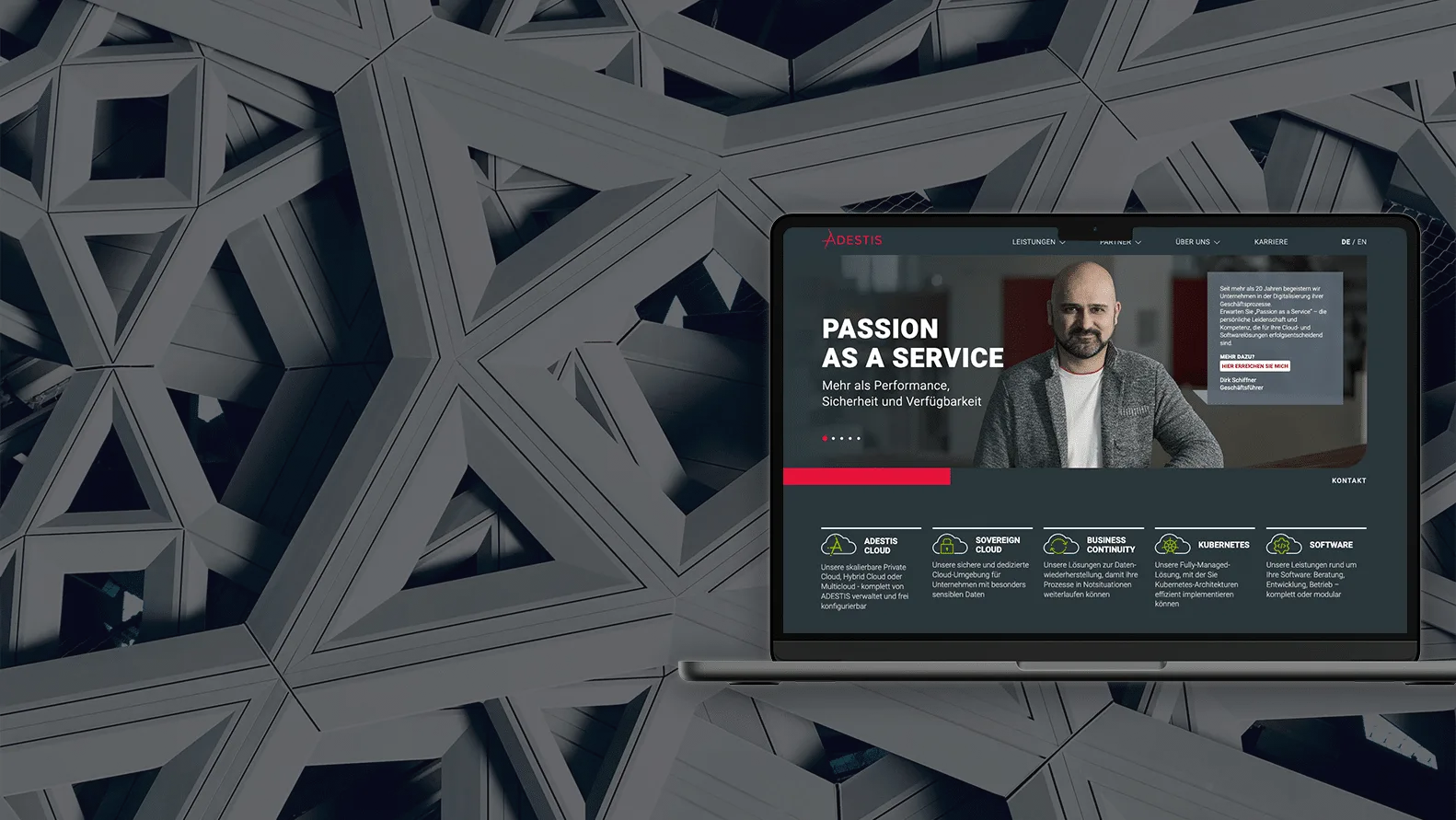
WEBSITE BACKGROUND



Cases
More stories.
-
Bosch Rexroth
·
MOBILE 2024 industry conference
25 expert talks, two languages, one stage for 400 top customers.




Contact
Let’s talk about your story.
One short conversation is enough to see where your communication could do more.

Kai Sievers
Managing Director